Sunday 23 October 2016

final film

These are screenshots from the final Production of our film "The Chase"


In the opening shot, The title is in the establishing shot which sweeps around the area of which I am going to walk.


The first main scene where the CIA agent (me) arranges a meet up with the man who receives the USB (Byron). This shot is a medium-close up of me whilst I talk to Byron


This is a cut away shot where Byron hands over the bag which we were suppose to make look heavy but failed. Besides that I think this cut away shot is quite cool for our first film.

This shot is a mid shot of the Hooded Kid (George) as he jumps over the wall to grab the USB (which I sadly couldn't find the footage of).


This I feel is a long shot of us running round the corner whilst getting the vehicles in the background.

This is a close up of George getting hit in the face by Byron. All though it does look acted out, it is in that angle that it looks like he actually looks like he got punched.


Here is another cut away shot of the USB being dropped on the floor by George. However, there is no footage of it being picked up, I think it is the better cut away of the two.

Stages of Production


Stages of Production

Finance
To get finances for a short film or movie will be different for the length of film. If it was a short film they will need less finances because there is less to take care of. However, if it is a big film like San Andreas you will need a lot more money to create this film due to it needing to close down so many streets. Funding small independent films come from grants or corporal sponsorship. E.G BBC, Fox etc. Larger films are financed by larger studios including 20th century Fox, warner bros, universal studios and more.

Script
Once the finances are acknowledged then the producers can go ahead and look at  creating the script.

Breakdown

The next part is to break the script down, by this the director and the producer will look at the script for main filming. This includes determining coverage and devising a schedule.
The director will create the storyboards
The producer would look over the filming schedule

Budget

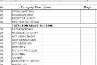
The budget should include the:
Wages (Pay of which the actors/actresses, crew members and extras get)
Props (Buy or Rent the props which are essential to the film)
Insurance (To cover the actors/actresses and stuntmen (crew) from suing the producers if they get injured. The equipment could also be insured encase anything went wrong)
Location (To cover for any expenses that may be caused through road closure or renting out a house or popular attraction)

Crewing
This area is finding who is able to operate which machine. For example, the camera, audio, lighting and possibly the microphone voice actors use.

Location
  1. Safety
Making sure that both the cast and crew are safe to film in the area. This can be done by doing a risk assessment of the area to make sure it fills all critical for the area.
2. Lighting
Making sure that the location offers good areas of light and does not give overexposure.  Area may need external light source for when you filming at night.
3. Wildlife
Making sure that wildlife and habitats are left alone. Research to make sure that filming location is not in a wildlife reserve and if you are allowed to film there.

4.Permission
Making sure that are allowed to film in that area. Always have a back location in case you are not allowed to film in the current location.
5. Climate
Making sure that you are in the right environment to film your film. For example, for a snowy film you will need a snowy or cold environment. Rather than filming a snowy film in the middle of a dessert.


casting
The casting stage is finding talented actors to take role in your film. The actors must be able to get into character and follow their lines correctly or the film would not look as good as planned.

rehearsals
Last stage of pre production, rehearsals. This stage is important and may take a while as it is basically making sure the cast know their roles on which they need to play throughout their part of the film, whether its being a voice actor or an on screen actor.
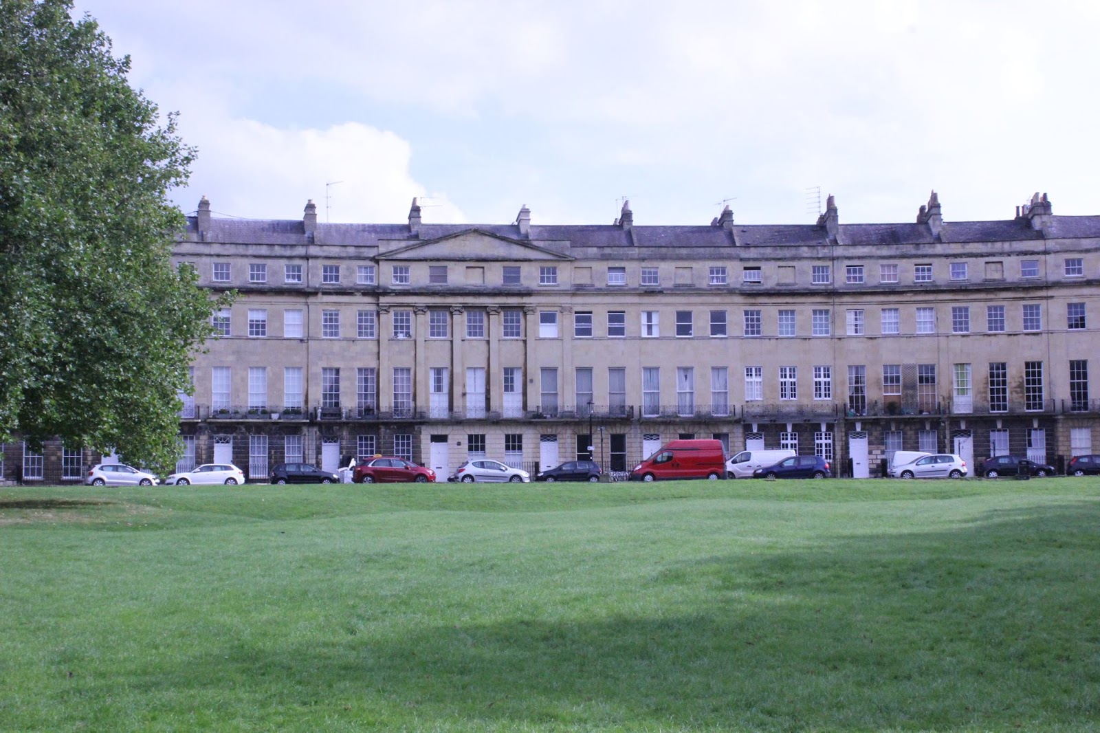
postcards

Inline images 1Inline images 2Inline images 4Inline images 3

Wednesday 19 October 2016

reflection

I think that the postcards ended up being more successful than I thought it would be and that what I created was interesting. I think that the Welcome to BATH one with pictures in each letter went well and was an interesting design at the end. I have learned to edit pictures in photoshop and how to fit different pictures in letters. If i was to do anything differently next time I would get more images and make a 4 way postcard and make the "I LOVE BATH" postcard more colourful.

Photography Techniques

These were the original photos from which I made postcards out of.


This is a low angle shot of the Abby.

This is a long shot of the crescent which we took originally before having to go back out to take the rest of them.


This is a high angle shot of a park


This is a wide shot of bath spa


This another high angle shot but with the weir this time.

Tuesday 18 October 2016

Other postcard designs

These are 3 of my other designs which I made along with the first and favourite one.


 This double picture postcard is one of the more impressive ones after the first one because I have had to erase out the white areas between the letters of the Bath logo. I also decided to erase both the people and the benches in the park, making it look better in my opinion.


This is a 3 way design which includes the crescent, bath spa and bath abby. This is one of the more creative ones because I decided to put all the buildings in one postcard to make it interesting and creative. whilst having the words "WELCOME TO BATH" in each of the pictures.
This design was my first one and was the most simple to put together as all I did was just change the brightness and added "I love Bath" on it. I feel that this is my worst design just because it is just a different colour to the original.

My Final Product

This is one of my favourite final design as i was able to draw on the "Welcome To BATH" writing and used an eraser to take out the black background  behind it, revealing different images behind them. In the picture of the park inside the H I have edited out a couple of people and leaves so the picture seemed more natural and green. What I like about this is the fact I was able to edit the background so that the pictures fit into each letter. However, other people don't really like the fact the letters aren't all the same size and I agree.


the importance of understanding an audience

Why is understanding a product’s audience useful for a designer?


Understanding a products audience is useful if not essential to selling that type of product, as the designer needs to know who this is aimed at and what it is used for. Some examples of a “target audience” would be kids, adults, gamers, teens, shop owners or McDonalds workers. The list is endless. Kids would like toys and perhaps dolls for girls. However, if you gave an adult this, they would probably think twice about it. I feel that target audiences are essential for selling products because if I were given a Barbie doll, I would probably throw it to my dog. But if you gave me an Xbox game then I would think differently. Another example would be if you gave an elderly person, around 70-80, an iPad or a PlayStation, there is a small chance they would know what to do with it, but if you gave this to maybe a teenager they would most likely be happy. My last example maybe that if you gave a teenager the new iPhone 7, they would love it. However if you gave it to a toddler, they would have no clue what it is and would just inadvertently take over a thousand pictures. The audience is essential and without it, toys and clothes would be made for the wrong person because you wouldn’t see 5 year olds in high heels or adults playing with a toy train track, would you? If yes then wow.

Importance of white balance

White balance is important as it determines how bright or how good the colour exposure is on a photo, screen etc. The colour is changed through wavelength, Auto White Balance and temperature.


This picture shows an image in different exposure types, from more blue to more green in the temperature which determines how bright or blue the picture is.


.

GAMUT

GAMUT
GAMUT is a range of colours on a device, whether it is a computer, printer or monitor screen. GAMUT can be seen as RGB (red, green and blue) which is used in computers and other screen related devices whereas CMYK (cyan, magenta, yellow and black) relates to printers.

colours

Colours of the 60's
The colours associated with the 60's are bright and psychedelic, connecting it to the hippies. the sixties were really colourful through the colour of their clothes, the vans, and the lights they may have used in concerts as it was the decade which innovated music


70's
The colours connected to the 70s would be dull and brown compared to the 60's. The seventies were the years where black and white TV's became more popular.


GIFs
there are a total of 257 different colours in a gif

Monday 17 October 2016

180 degree rule

The 180 degree rule is a metaphorical line or line of action on which the camera should not pass over, as seen in picture below. The cameras are supposed to stay in one side of the line at all times, especially during a conversation so the audience doesn't get confused on where each person is standing. the green cameras in the blue area are on the correct side of the 180 degrees whereas the red camera is showing that it's on the wrong side of the line. The red camera isn't really on the wrong side all together it's just that it breaks the 180 degree rule turning it into a reverse angle on which is a different topic. The line is also there to show the eye line and looking space between 2 characters. The 180 Degree Rule says that 2 characters in a scene should always stay on their side of the screen. If you don't follow the 180 Degree Rule, or decide to break it, it changes the scene confuses the audience. When you break the 180 line, a person who was originally facing left in a scene is now facing right.


research types

Their are two main types of research, primary and secondary.

Primary research is what you find out , your opinion, others opinion and internet research. This could be carried out through surveys and asking the public what their views and opinions are on your specific topic. One way of doing this is creating your own survey and see what the answers are. Another could be going out and around town and ask a couple of simple and short questions on which they may be willing to answer.  This would include information that you feel are more appropriate without getting information and opinions from others. Your opinion is practically the main feature towards this area as it is your research which is being carried out.

Evidently, there is secondary research which moves away from what you know or think and goes towards what you can find on the internet and/or in books. This would be quicker as you may easily get a straight and informative answer.

Sunday 16 October 2016

audience

Understanding an audience for a specific media product is essential as it shows that the designers know what their target audience is interested in. For example, teenagers may not want to watch Antiques Roadshow whereas adults do not necessarily want to watch SpongeBob Squarepants. The audience is essential as the media want their product to appeal to their target readers or viewers. Vocabulary that is used should be appropriate for a specific audience, for example slang terms would not be appropriate for an older age group. If you created perhaps a blog without knowing who your target audience is then you may struggle to get your point across to your specified readers.

Tuesday 11 October 2016

colour spectrum

In class, we were able to go around bath to look for different colours of the spectrum and take pictures of them. From these images we had to make our own colour wheel/ spectrum in Indesign. These images are what I created with the colours I had. I think that the easiest colours to find were red and yellow opposing to the harder colours which were green and purple.


 To start with, I put all the colours in equally sized boxes so I know what colours I'm working with. The images from which I have taken pictures of have been cropped to fit the size of these boxes.


Secondly, I arranged them into colour order and into neat columns. Each columns have their individual colours. i.e blues, yellows, reds and pinks.


This was my first pattern, the colour wheel. Fortunately, we found a poster with its own colour wheel where I took  photo of it and stuck it in the middle of the wheel to get the idea of where to put each of the individual colours.


The second pattern is   well a cluster of certain colours in different places, again around the wheel whilst still in a colour scheme way as in they are in their individual place.


Finally, the large cluster of colours. This was just a quick design showing or suppose to show how close the colours are to each other.

Monday 10 October 2016

postcards

postcards designs and fonts

This is an example of secondary research which is conducted by moving away from your opinion and looking at other peoples views on what a good postcard looks like. These fonts and postcards are good for carrying out research as it gives you a vague idea on what is included in a postcard. The 2 postcards were found on the internet, one was comedic and the other was a holiday one. The book/ magazine was found in the college library. I took a picture of it as I like the font and that it would look good on a postcard.


 The "Dazed" font is bold, all in caps and stands out which is good for the audience to read. However, it seems to be very basic and too commonly used.
 This is practically supposed to be a funny postcard from Mars, delivered from NASA.  Besides that, the font is again in bold and caps but also has another form of font above saying "greetings from."

This is a postcard of a beach which only the location is in words as the beach is maybe all that is needed to convince the receiver that this is a great place to go.


illustrator pt 2


 This is all created in adobe illustrator

The first picture is from a pie chart which we individually created using the data which we were given. We the used the 3D effect to evidently make the chart 3D.


This screenshot shows an attempt of a  self portrait on the right and a quick picture of kermit on the left. I say attempt because it is my first attempt of drawing myself using this software.

This is a before and after of my poster about When is it OK to swear or use bad language in class. the first picture doesn't say anything about no swearing and has a person basically swearing. The second picture basically says No swearing as it has one of those Don't Do this signs around it. And the final one says under the no swearing sign, "Is it really OK to swear in class.


Briefs

Briefs are important as it needs to tell the person or group what is expected in their project. For example, a brief is a set of instructions which the given details may vary. These instructions are essential to the clients needs and requirements before a specific deadline date. The details vary between a tight, very specific project and a low detailed brief. Allowing the person or group to have more freedom over what they are producing.


This brief is not as detailed as some of the other ones meaning that the person creating this document has the ability to freely add or design the document as they want, whilst staying within the project boundaries.


This is a very detailed (bad quality picture of) brief for a short film and posters. This is telling someone that the client wants a specific topic to collaborate with acting or dancing whilst making a small film to go with their audience. I feel that this is a good brief as it is specific but not to closed off. It shows what is needed but also allows the actors to act out in their own way.
this is a basic BT media brief. There is not much information to go by but tells the person creating it what is expected in the outcome.
This is a brief template which the client can fill in what they want created and how they want it to look like. This is a large brief so the client can put as much of detail in as they want, whether its lots or little amount of detail.


Sunday 2 October 2016

Ilustrator

In illustrator, you are able to create a range of different shapes and objects that you wish to make.


An object is a shape, design or object that is the subject of what you have created such as a rectangle, circle or star.
Paths
These are different types of paths, open and closed paths. The open paths are the 2 lines shown
above where their ends do not meet whereas the 2 shapes bellow are closed lines as the ends do meet,
creating an object.


The stroke

The stroke panel can change certain details of an object, including the thickness (weight), dashed line, which basically creates lines dotting around the initial object, finally the "dash" and "gap" options allows you to change the width of both the gap and the dashes. If you add a number in the first box will apply to all boxes so both the dashes and gaps are the same lengths, however, if you put another number in the first "gap" box that is different to the "dash" one then the dashes and the gaps will be different throughout the shape or chosen object.


The Fill


The fill is the interior colour of a shape or closed line path which is located next to the stroke option in the top hot bar. When colour is chosen in the colour box of the menu, the selected shape will be automatically filled in.